Overview
Background
The Real Priority: De-risking the Redesign
Research-Driven Exploration
The Final Design
The Untold Story: Performance, Not Design
Contributing to the Facebook Design System

Helping drive the largest redesign in human history.

Meta

Helping drive the largest redesign in human history.

Design lead for the consumer Pages experience during Facebook's 2018 app overhaul—170M+ monthly users on the surfaces I led redesign on.

Facebook Pages - 2018 FB App Redesign

Background

In 2018, the Facebook App organization undertook a massive redesign of both Facebook.com and the Facebook mobile app. I was the design lead on the Facebook Pages consumer experience profiles specifically for business entities, large and small, used internationally with over 170 million monthly active users.

Pages provides Facebook users a high-context surface to qualify, follow, and communicate with businesses. Think of it as a consideration surface comparable to Yelp, but with deeper social context and more open dialogue between businesses and customers.

The Real Priority: De-risking the Redesign

This effort wasn’t about solving a singular, well-defined user problem through sweeping strategic change. Instead, the priority was to de-risk adoption of the new design system using the transition as a chance to introduce smaller, controlled optimizations that could be easily rolled back.

With an org-wide push underway, we moved to bundle surface-level improvements into the migration. While we were deliberate about preserving proven mechanics, we developed and tested multiple prototypes in research to validate and deepen our understanding of the value Pages deliver to people.

Research-Driven Exploration

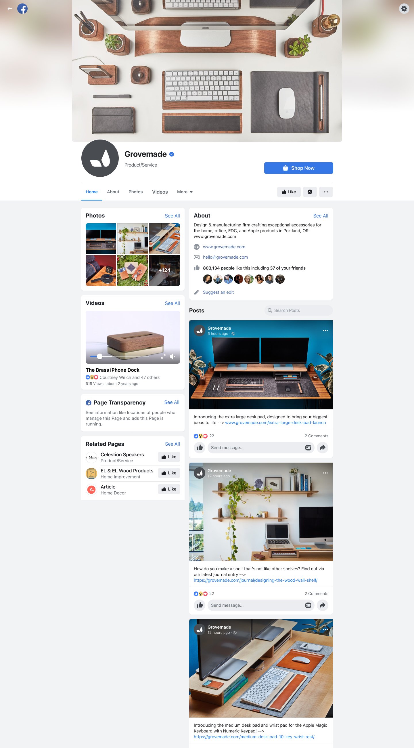
The findings primarily informed better information architecture, with a focus on de-risking the new design system rather than over-indexing on pattern changes.

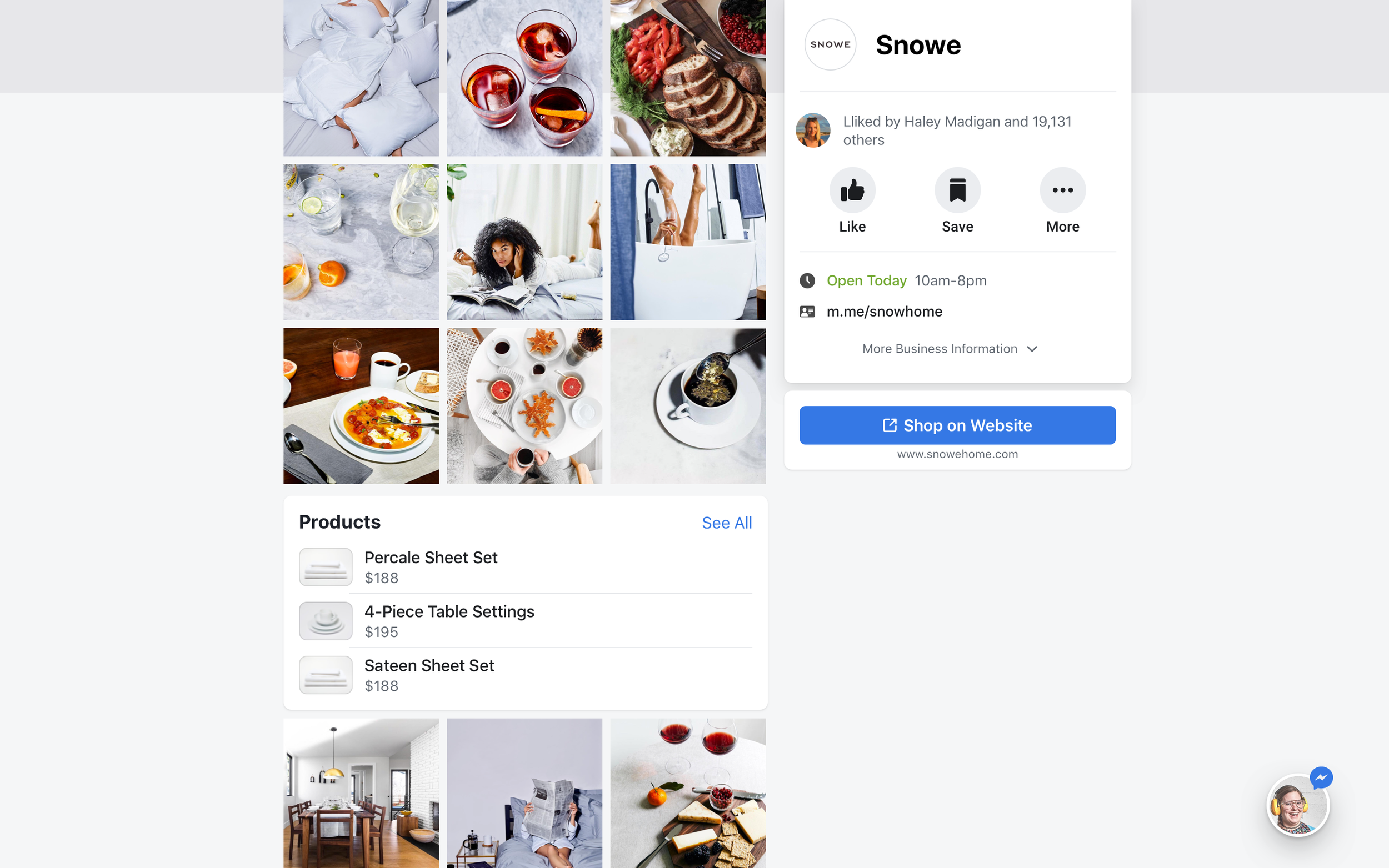
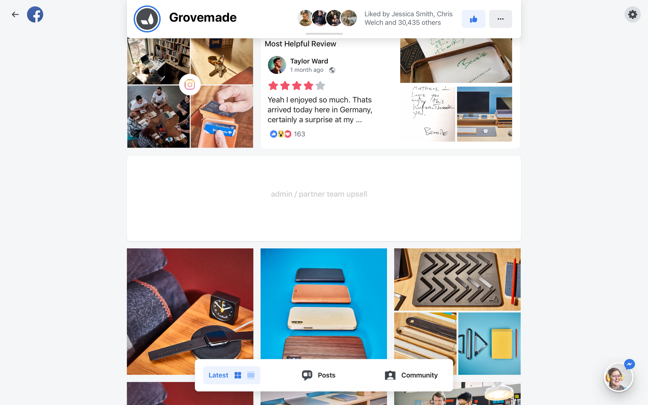
Photo & community-driven consideration: Research and metrics showed that a large part of Page qualification was driven by photos and community feedback. This layout leaned into that signal.

Photo and community-driven Page layout

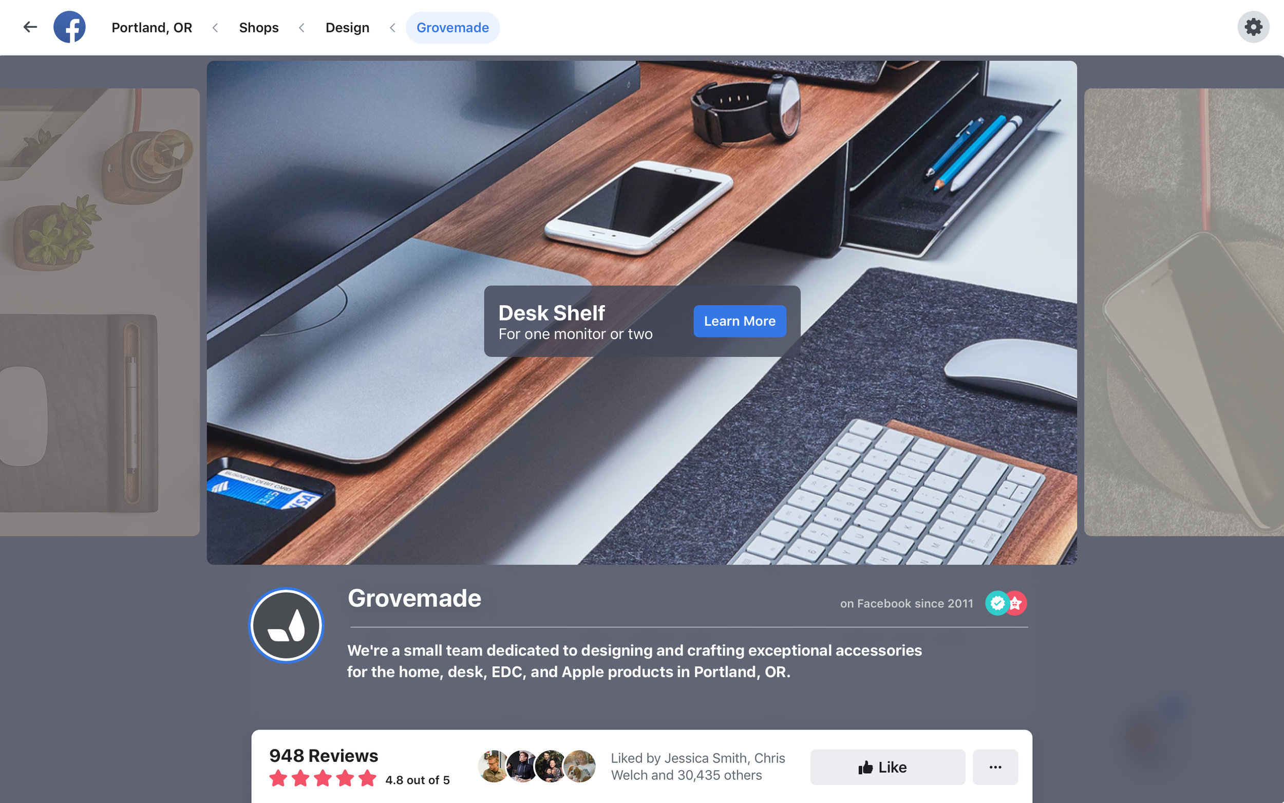
Fixed business information: While media and community feedback provided consideration signals, the most important information to surface immediately was the business essentials — hours, location, contact info. This layout experimented with a fixed right column ensuring availability at all times.

Fixed business info column with scrolling signals

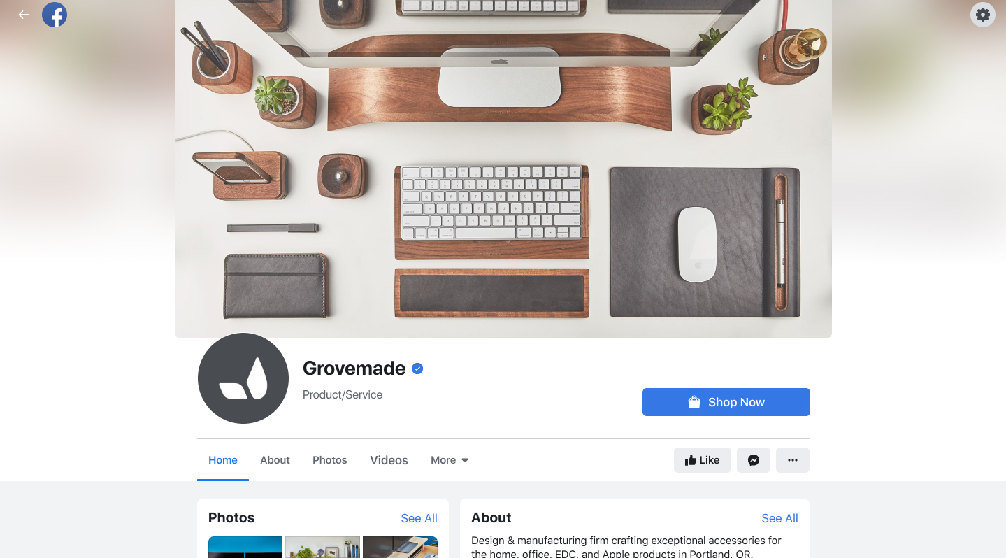
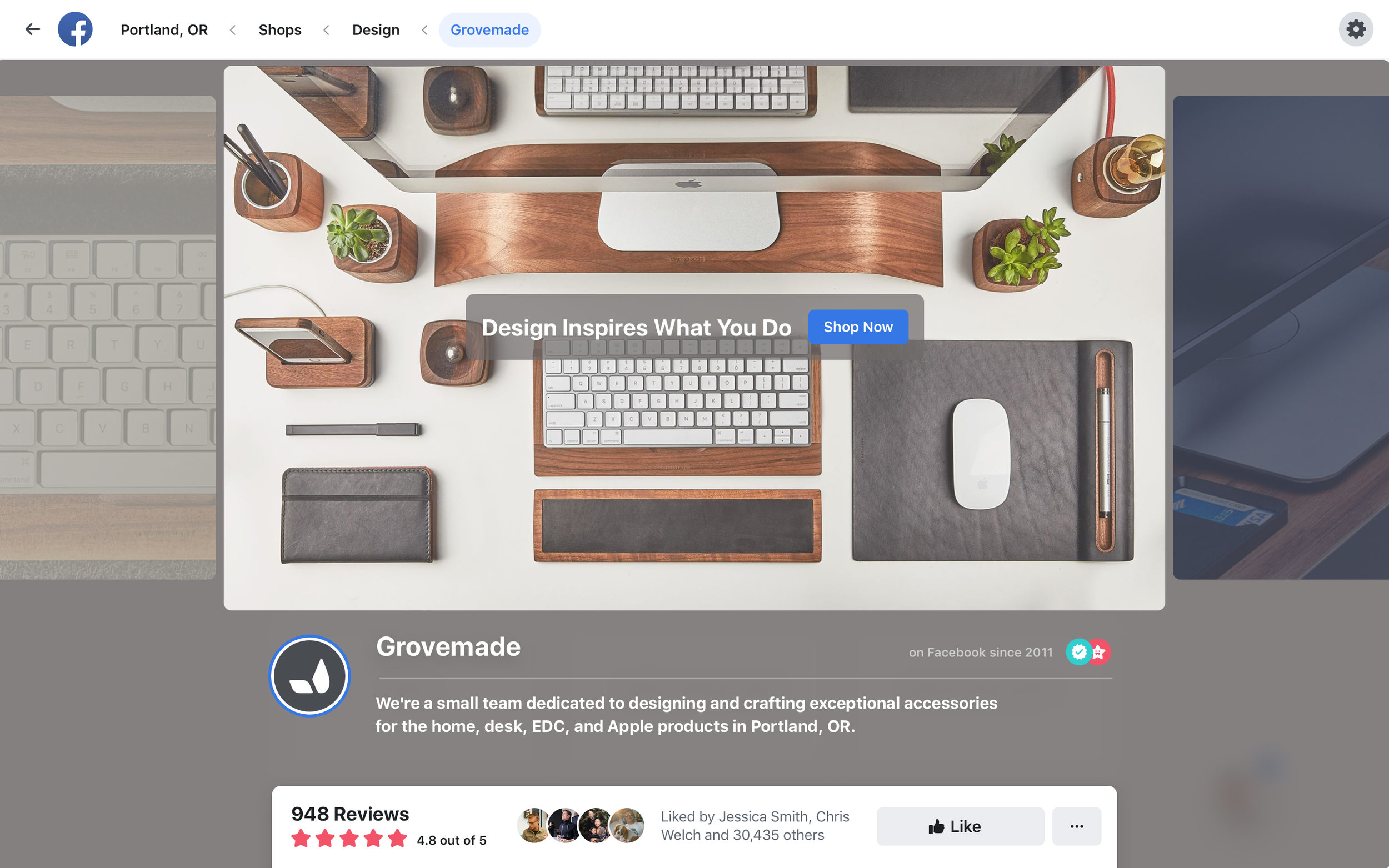
Header as a communication channel: We observed a latent admin behavior — businesses consistently used the header image to share important news or promotions. This variant leaned into that pattern.

Expanded banner interaction concept

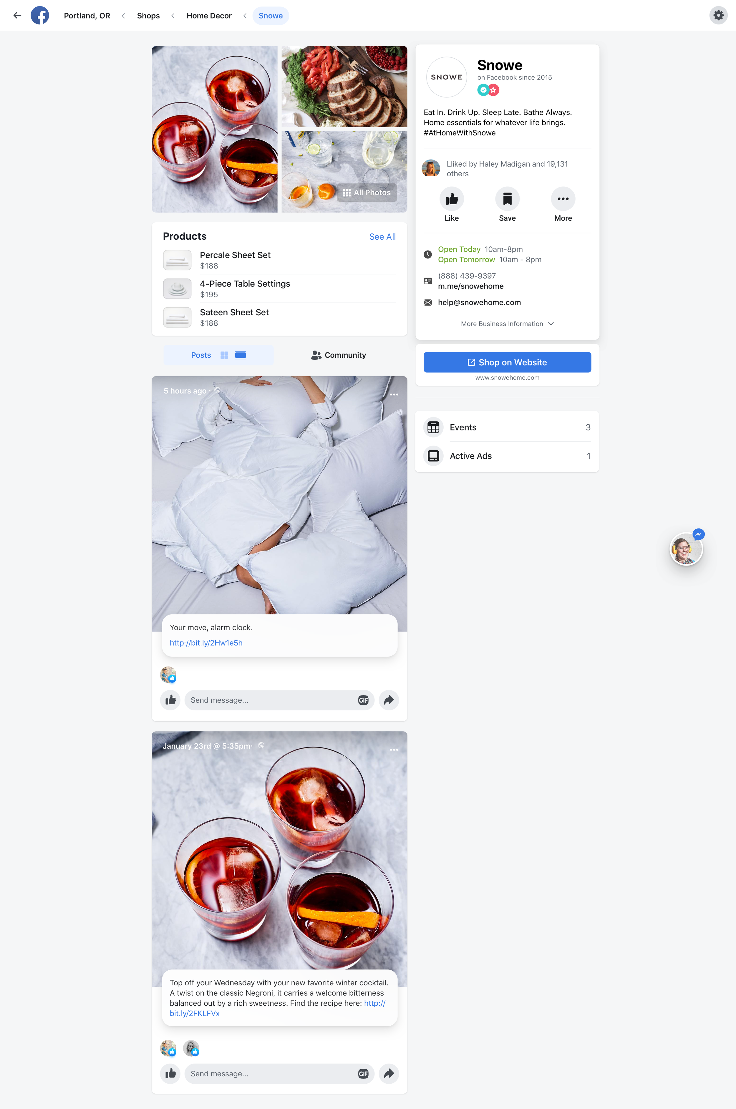
The interaction first presented Page information, but once a user engaged with the banner content, the page info would get out of the way. The banner then allowed Page admins to provide curated featured content via side-scroll.
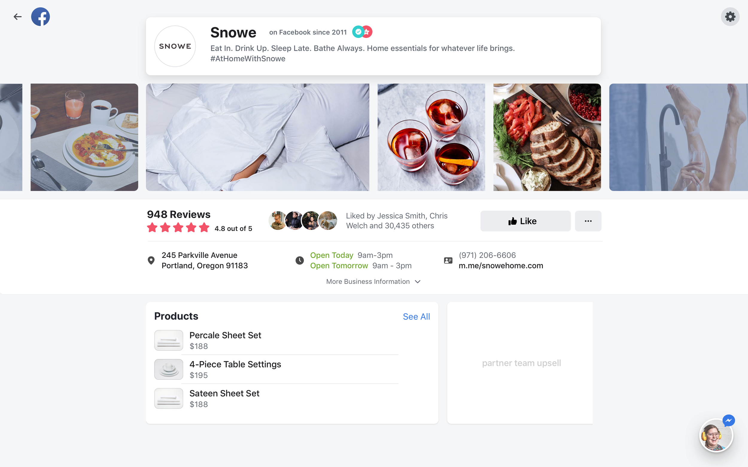
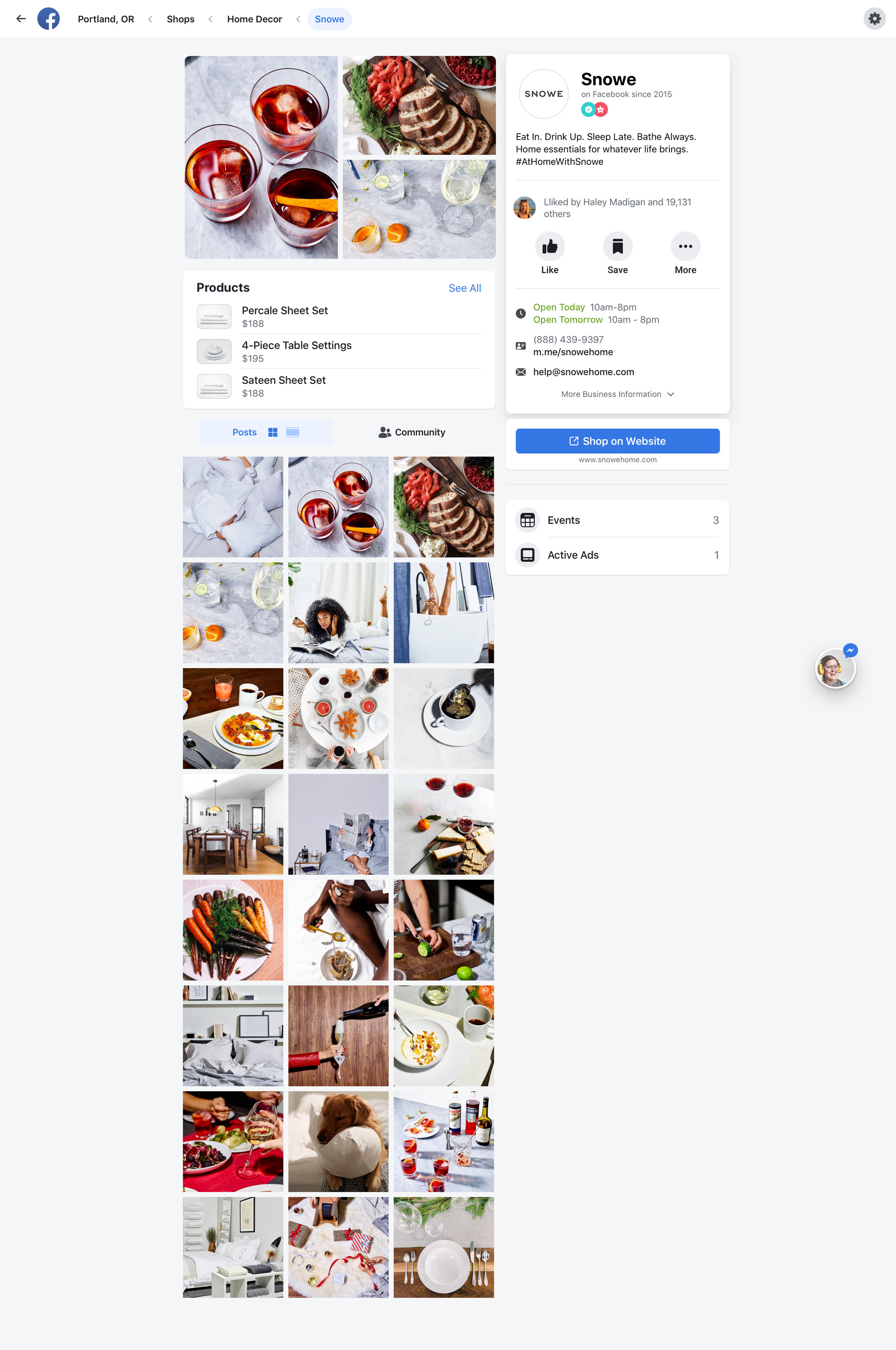
Banner content expansion with swipe

Alternative exploration with less interaction dependency

Mobile exploration variants

Additional layout explorations

Component-level exploration

Information architecture refinement

Responsive layout behavior

The Final Design

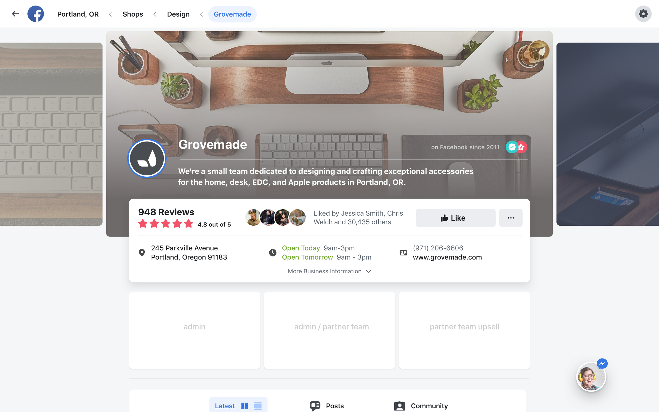
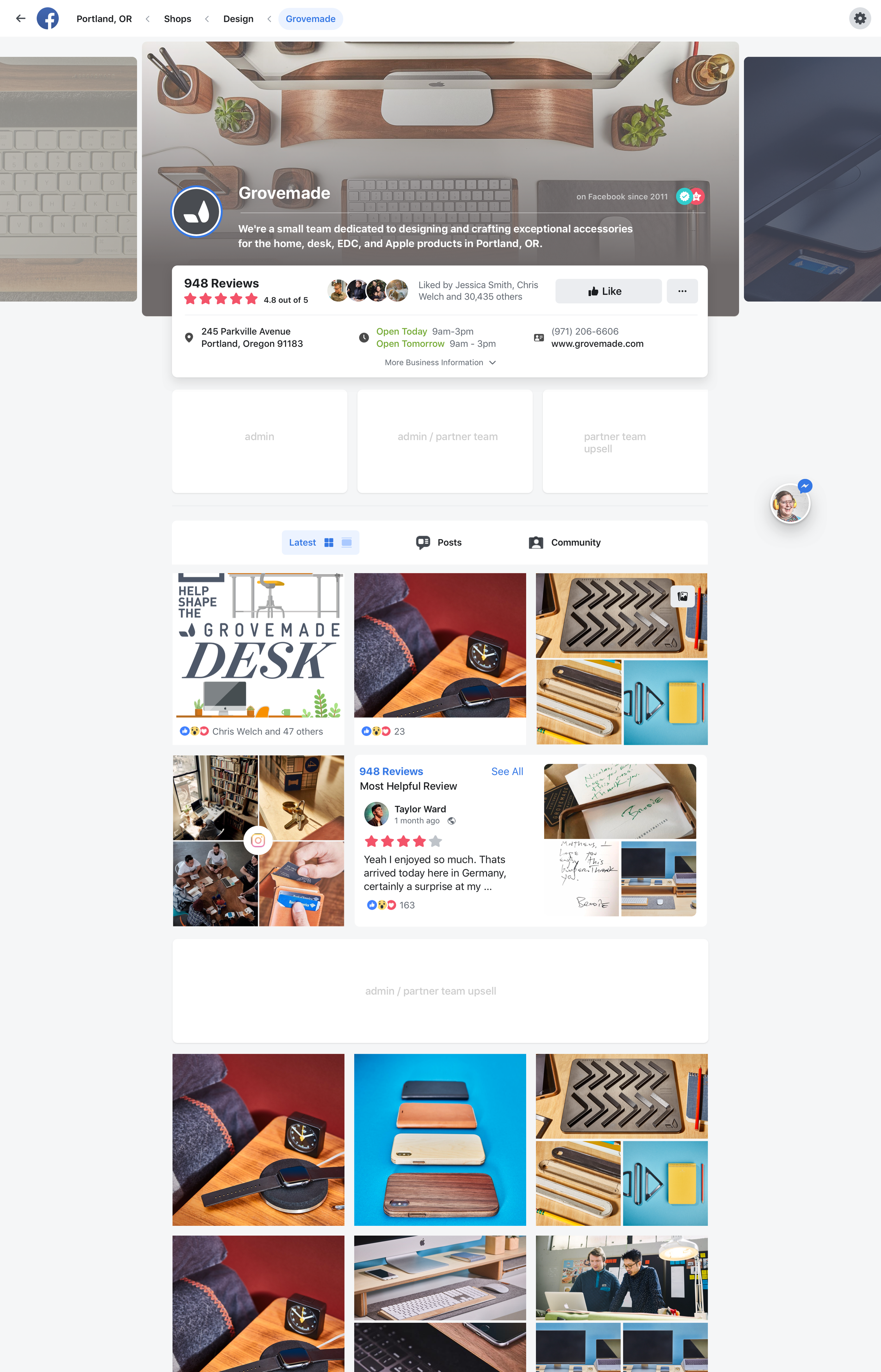
The shipped version was a closer representation of the previous design with targeted IA optimizations — the conservative bet that de-risked the transition while still improving the experience.

Final shipped Pages experience

Redesigned Pages on the new web component system

The Untold Story: Performance, Not Design

The Facebook App redesign was actually driven by performance, not design experience. The entire front-end stack was moved to React. Since everything was being rebuilt, it was a logical opportunity to modernize the visual experience — but performance was the primary goal.

The Facebook Design System group leveraged the recently created mobile design system to inform a web version for a "mobile first" web experience. The fallback strategy: if the new experience created too many regressions, the old design would be re-implemented on top of the new React components, still retaining the engineering work.

Loading states we called "glimmers" had to be designed and implemented separately for all components — they weren't built into the component system itself.

Contributing to the Facebook Design System

A dedicated internal team owned the core design system and used a contribution model to scale across the organization. The baseline components were intentionally open-ended, enabling designers with deeper surface context to propose new patterns. The core team then reviewed and qualified contributions before incorporating them into the system.

Pages, as a platform other teams built on, produced patterns not originally defined in the core design system. One example is the header visual design, which I created and spec’d for the new Facebook.com and is now used across billions of business and personal profiles.

Video exploration: In response to strong demand from Page admins, especially for gaming and Facebook Watch profiles, I explored extending the system to support video and responsive behavior. Inspired by Philips Hue Sync, I used CSS blur effects to create ambient treatments that enhanced video while maintaining visual quality. Although the concept was not shipped due to performance constraints, it expanded the boundaries of what the design system could support.

Would you like some music
for the right vibes?

What's the mood?